COVID-19, the disease caused by a novel coronavirus first identified late last year in Wuhan, China, is spreading across the globe. The charts and maps below will update automatically with the latest data compiled from WHO and other sources by researchers at Johns Hopkins University.
COVID-19 cases and deaths worldwide
Peter Aldhous / BuzzFeed News
Toggle between the Total cases, New cases, and Deaths tabs to track the coronavirus outbreak. The New Cases tab shows what experts call the “epidemic curve,” in which the number of cases newly diagnosed each day typically rises over time and then falls. New case numbers have already declined in China, where stringent quarantine measures were put in place to try and limit the spread from the initial epicenter of COVID-19 in Wuhan.
The big question is what will happen now that the virus has started to spread from person to person in other countries.
Total cases in China vs. other countries
Peter Aldhous / BuzzFeed News
So far, the vast majority of cases and deaths have been in China. The sudden jump in Chinese cases on Feb. 13 was due to a change in how they diagnosed and counted. Prior to this date, cases were only added to the tally if lab tests found the virus in swab samples taken from patients. But on that date, patients with lung scans showing the characteristic pneumonia seen in COVID-19 were added to the total.
Total deaths in China vs. other countries
Peter Aldhous / BuzzFeed News
Now the virus is spreading in other countries, led by outbreaks in South Korea, Italy, and Iran. The table below will track cases in each country as the epidemic continues.
Total cases and deaths by country
Peter Aldhous / BuzzFeed News
Peter Aldhous / BuzzFeed News / Via Johns Hopkins University CSSE
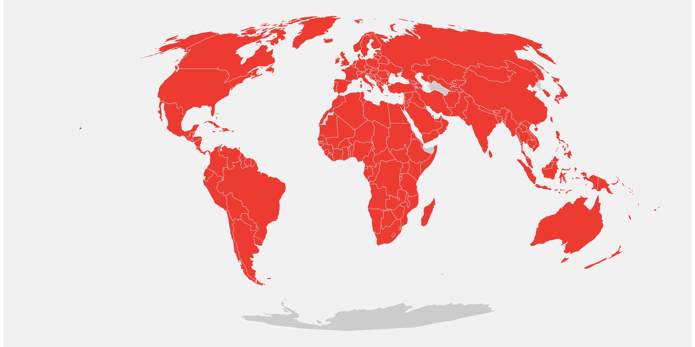
This map colors every country that has seen at least one case of COVID-19 in red. But don’t assume that the virus isn’t present in countries that remain gray — some have a limited capacity to run lab tests to confirm cases. Indeed, the US may be missing cases, because a genetic test for the virus made by the CDC initially proved unreliable in practice.
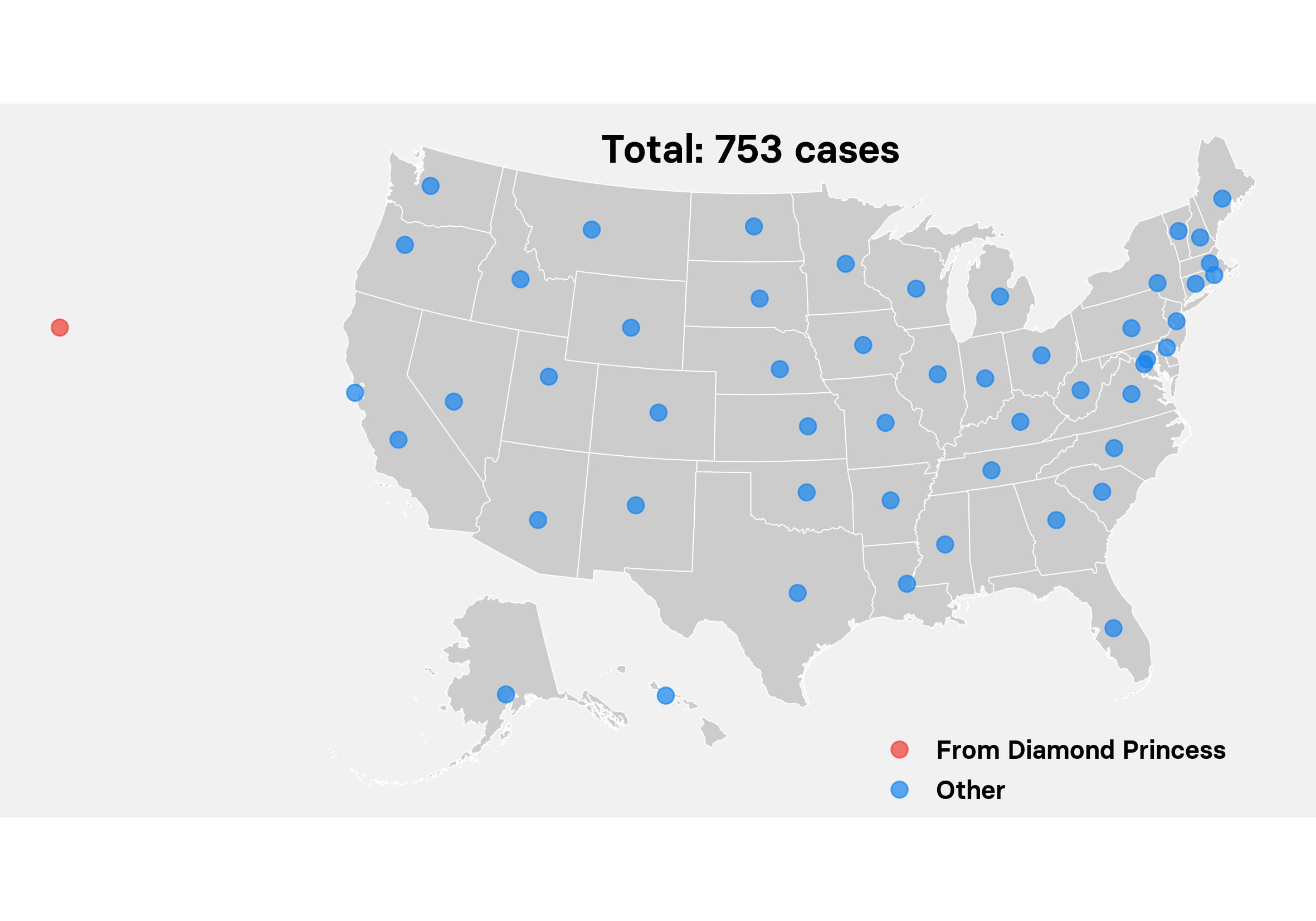
Case locations in the US
Peter Aldhous / BuzzFeed News / Via Johns Hopkins University CSSE
This map shows the locations of all the confirmed cases in the US. So far, most cases have been in people who were exposed to the virus abroad. The biggest concentration of US residents who contracted the virus were confined on the Diamond Princess cruise ship in Yokohama, Japan — in what public health experts say was a badly botched attempt at quarantine.
US evacuees from the Diamond Princess have been brought back to three sites: Travis Air Force Base in California, Joint Base San Antonio-Lackland in Texas, and the University of Nebraska Medical Center in Omaha, represented by the red circles. Each blue circle represents a location with at least one confirmed case.
Source link Education And Science
The post These Charts And Maps Show How The Coronavirus Is Spreading Across The World appeared first on Viral Trending Content.
from WordPress https://ift.tt/39dkxcK
via IFTTT
Comments
Post a Comment